Simplify collection view compositional layout with a DSL
At the WWDC19 Apple introduced a class UICollectionViewCompositionalLayout. This new API allows us to create a custom layout
in a declarative and composable way. It is available from iOS 13, tvOS 13 and macOS 10.15.
Here are some examples of compositional layout from Apple sample code Implementing Modern Collection Views:
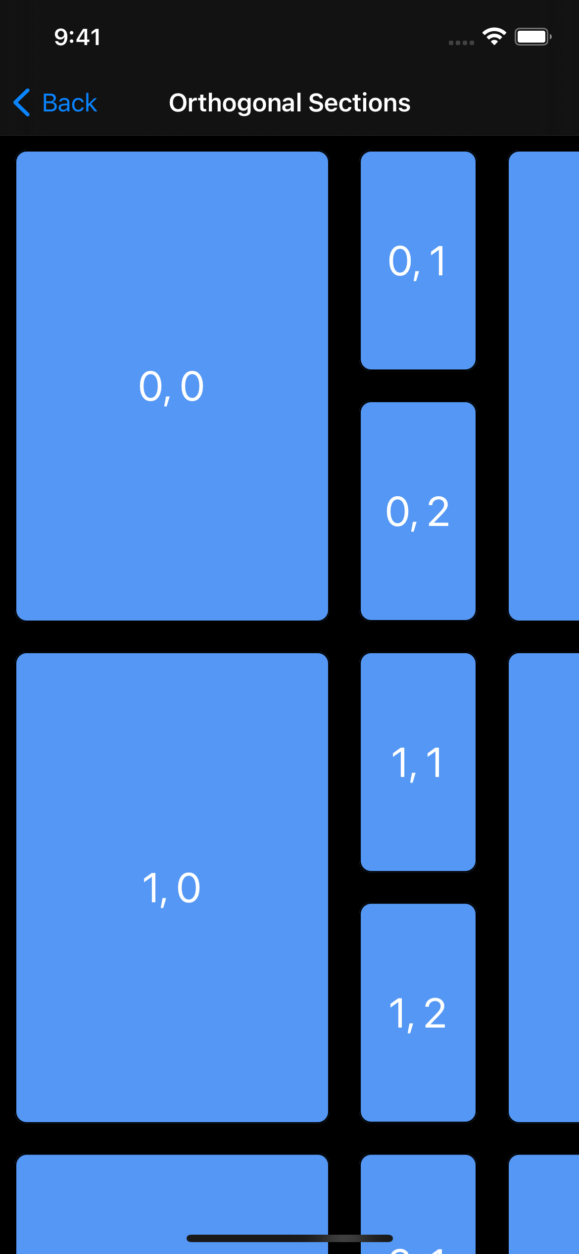
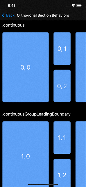
A compositional layout is composed of sections containing groups, and the groups contain items. There are also supplementary items and boundary supplementary items for headers, footers or any custom supplementary view like badges. One of the best feature of compositonal layouts is the ability to have multi-dimensional browsing with the orthogonal scrolling behavior (see gif above).
Here is for example the code for the layout with nested groups and orthogonal scrolling:
let leadingItem = NSCollectionLayoutItem(
    layoutSize: NSCollectionLayoutSize(widthDimension: .fractionalWidth(0.7),
                                       heightDimension: .fractionalHeight(1.0)))
leadingItem.contentInsets = NSDirectionalEdgeInsets(top: 10, leading: 10, bottom: 10, trailing: 10)

let trailingItem = NSCollectionLayoutItem(
    layoutSize: NSCollectionLayoutSize(widthDimension: .fractionalWidth(1.0),
                                       heightDimension: .fractionalHeight(0.3)))
trailingItem.contentInsets = NSDirectionalEdgeInsets(top: 10, leading: 10, bottom: 10, trailing: 10)
let trailingGroup = NSCollectionLayoutGroup.vertical(
    layoutSize: NSCollectionLayoutSize(widthDimension: .fractionalWidth(0.3),
                                       heightDimension: .fractionalHeight(1.0)),
    subitem: trailingItem, count: 2)

let containerGroup = NSCollectionLayoutGroup.horizontal(
    layoutSize: NSCollectionLayoutSize(widthDimension: .fractionalWidth(0.85),
                                       heightDimension: .fractionalHeight(0.4)),
    subitems: [leadingItem, trailingGroup])
let section = NSCollectionLayoutSection(group: containerGroup)
section.orthogonalScrollingBehavior = .continuous
let layout = UICollectionViewCompositionalLayout(section: section)
This code works well, but it has some issues:
- it is quite verbose
- it is not easy to read
- it is hard to visualize what this layout is building
Let’s see in the following section how we can tackle these problems.
Domain-specific language for UICollectionViewCompositionalLayout
With the Swift 5.1 @_functionBuilder (now @resultBuilder in Swift 5.4) and SwiftUI being popular,
a domain-specific language (DSL) can be a great way
to improve the UICollectionViewCompositionalLayout API.
By looking at the SwiftUI DSL created by Apple, we can model a similar syntax to rewrite the previous example into something like that:
let layout = LayoutBuilder {
    Section {
        HGroup {
            Item()
                .width(.fractionalWidth(0.7))
                .contentInsets(value: 10)
            VGroup(count: 2) {
                Item().contentInsets(value: 10)
            }
            .width(.fractionalWidth(0.3))
        }
        .height(.fractionalHeight(0.4))
        .width(.fractionalWidth(0.85))
    }
    .orthogonalScrollingBehavior(.continuous)
}
This code has several advantages compared to the UIKit API:
- it is shorter
- it is easy to read with a SwiftUI like syntax
- it is way more visual: the syntax follows the structure of the layout
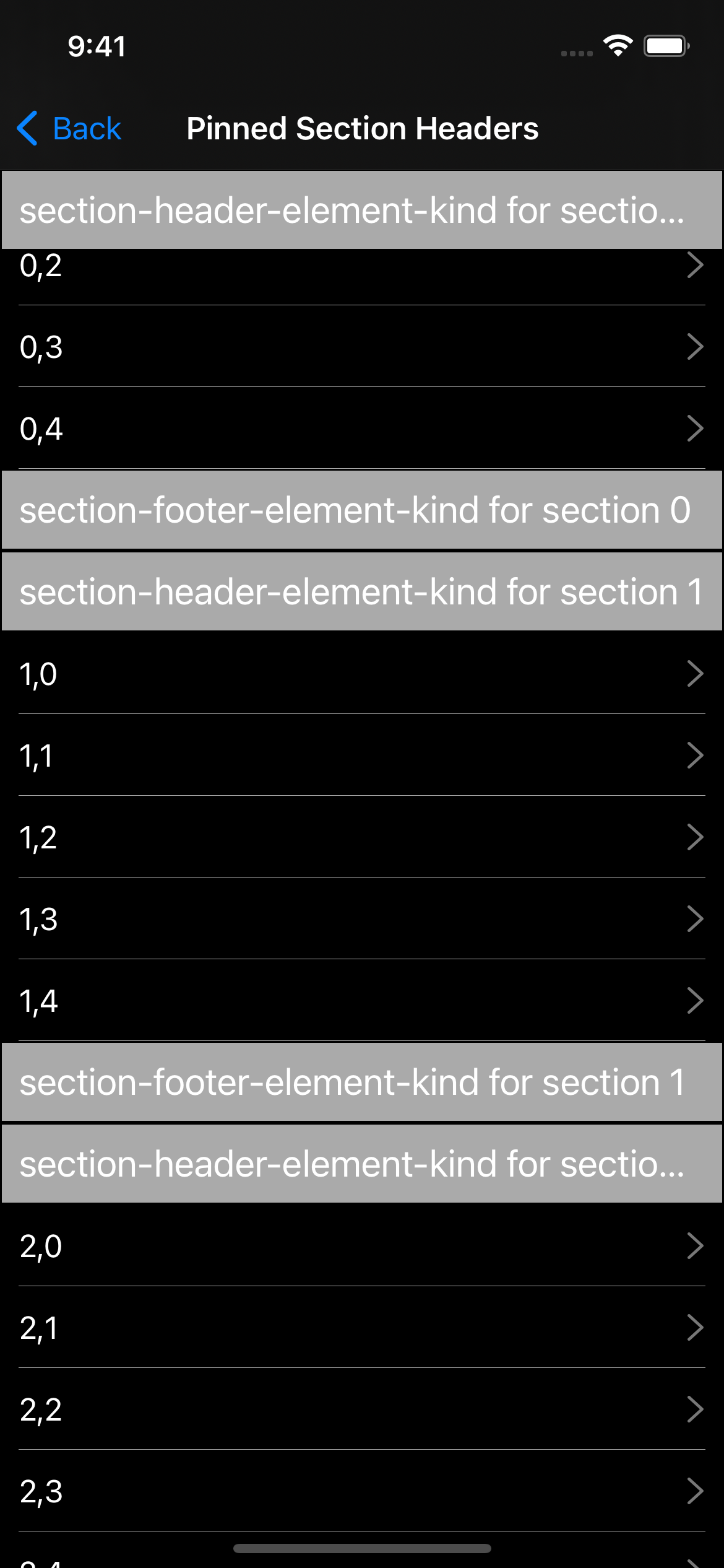
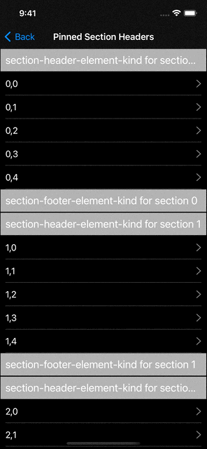
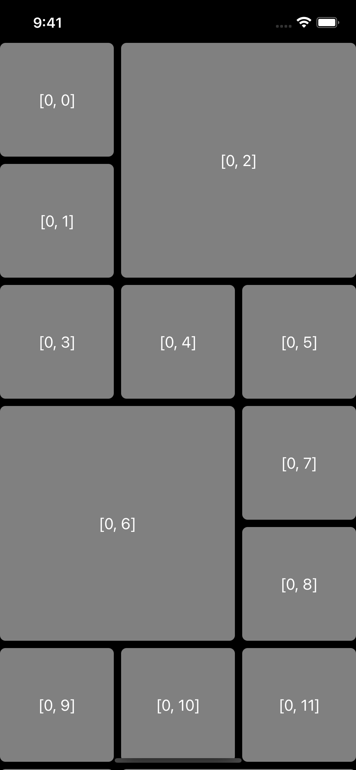
Here is another example, where we focus on a simple list layout:
With UIKit, we would implement this layout like this:
let itemSize = NSCollectionLayoutSize(widthDimension: .fractionalWidth(1.0),
                                      heightDimension: .fractionalHeight(1.0))
let item = NSCollectionLayoutItem(layoutSize: itemSize)

let groupSize = NSCollectionLayoutSize(widthDimension: .fractionalWidth(1.0),
                                       heightDimension: .absolute(44))
let group = NSCollectionLayoutGroup.horizontal(layoutSize: groupSize, subitems: [item])

let section = NSCollectionLayoutSection(group: group)
section.interGroupSpacing = 5
section.contentInsets = NSDirectionalEdgeInsets(top: 0, leading: 10, bottom: 0, trailing: 10)

let sectionHeader = NSCollectionLayoutBoundarySupplementaryItem(
    layoutSize: NSCollectionLayoutSize(widthDimension: .fractionalWidth(1.0),
                                       heightDimension: .estimated(44)),
    elementKind: PinnedSectionHeaderFooterViewController.sectionHeaderElementKind,
    alignment: .top)
let sectionFooter = NSCollectionLayoutBoundarySupplementaryItem(
    layoutSize: NSCollectionLayoutSize(widthDimension: .fractionalWidth(1.0),
                                       heightDimension: .estimated(44)),
    elementKind: PinnedSectionHeaderFooterViewController.sectionFooterElementKind,
    alignment: .bottom)
sectionHeader.pinToVisibleBounds = true
sectionHeader.zIndex = 2
section.boundarySupplementaryItems = [sectionHeader, sectionFooter]
let layout = UICollectionViewCompositionalLayout(section: section)
The same layout with the DSL becomes:
let layout = LayoutBuilder {
    Section {
        HGroup {
            Item()
        }
        .height(.absolute(44))
    }
    .boundarySupplementaryItems {
        BoundarySupplementaryItem(
            elementKind: PinnedSectionHeaderFooterViewController.sectionHeaderElementKind
        )
        .height(.estimated(44))
        .alignment(.top)
        .pinToVisibleBounds(true)
        .zIndex(zIndex: 2)
        BoundarySupplementaryItem(
            elementKind: PinnedSectionHeaderFooterViewController.sectionFooterElementKind
        )
        .height(.estimated(44))
        .alignment(.bottom)
    }
}
The CompositionalLayoutDSL library
If you liked the proposed DSL syntax, here’s great news:
The previous examples of code using the DSL can actually be used right now with our new
library CompositionalLayoutDSL!
This library gives you the DSL, and it also gives you the ability to compose your layout in a SwiftUI manner, making it all the easier to reuse custom layouts, as well as improving readability.
Let’s take the following layout as an example:
You can create your own structs to represent custom groups, making them reusable in your project:
struct TiledGroup: LayoutGroup {
    let width: CGFloat
    let inset: CGFloat

    var layoutGroup: LayoutGroup {
        VGroup {
            bigCellTrailing
            threeSmallCells
            bigCellLeading
            threeSmallCells
        }
        .height(.absolute(totalHeight))
        .interItemSpacing(.fixed(inset))
    }

    // Computed values
    private var smallCellSize: CGFloat {
        return (width - inset * 2) / 3
    }

    private var bigCellSize: CGFloat {
        return smallCellSize * 2 + inset
    }

    private var totalHeight: CGFloat {
        return (bigCellSize + inset + smallCellSize) * 2 + inset
    }

    // Groups
    private var bigCellTrailing: LayoutGroup {
        HGroup {
            VGroup(count: 2) { Item() }
                .width(.absolute(smallCellSize))
                .interItemSpacing(.fixed(inset))
            Item()
                .width(.absolute(bigCellSize))
        }
        .height(.absolute(bigCellSize))
        .interItemSpacing(.fixed(inset))
    }

    private var bigCellLeading: LayoutGroup {
        HGroup {
            Item()
                .width(.absolute(bigCellSize))
            VGroup(count: 2) { Item() }
                .width(.absolute(smallCellSize))
                .interItemSpacing(.fixed(inset))
        }
        .height(.absolute(bigCellSize))
        .interItemSpacing(.fixed(inset))
    }

    private var threeSmallCells: LayoutGroup {
        HGroup(count: 3) { Item() }
            .height(.absolute(smallCellSize))
            .interItemSpacing(.fixed(inset))
    }
}
Creating your own structs to represent your objects is possible for all components of a compositional layout.
Here is an example that conforms to LayoutSection:
struct TiledSection: LayoutSection {
    private let inset: CGFloat = 8

    let environment: NSCollectionLayoutEnvironment

    var layoutSection: LayoutSection {
        Section {
            TiledGroup(
            	width: environment.container.effectiveContentSize.width,
            	inset: inset
            )
        }
        .interGroupSpacing(inset)
    }
}
And when you want to use the custom section you configure your collection view like that:
// To apply the layout to the collection view
let compositionalLayout = CompositionalLayout { section, environment in
    TiledSection(environment: environment)
}
.interSectionSpacing(8)
collectionView.setCollectionViewLayout(compositionalLayout, animated: false)
All the other compositional layouts availables in the
Apple sample code
have also been adapted to use the DSL, you can find the changes in
this repository.
If you want to see more of this library in action you can have a look at the example app.
Conclusion
Compositional layout has been introduced by Apple in 2019 and gives you the power of creating great layouts easily.
While declarative, the UIKit API is quite verbose and therefore hard to read and visualize.
To solve those issues we have created a new library CompositionalLayoutDSL
which provides a DSL that makes compositional layout code shorter, more readable and reusable.
CompositionalLayoutDSL requires at least Swift 5.1, and is available on the platforms supporting the compositional layout API (iOS 13+, tvOS 13+ and macOS 10.15+). You can use this library in your project using the Swift Package Manager, CocoaPods or Carthage.