on
Angular 5+ & proper styling
Since switching to Angular2+ two years ago, we’ve had the opportunity to work on several large-scale projects. It feels like the time is right to reflect on the best practices we put in place, especially with regard to styling. Although the framework guidelines are very extensive when it comes to the architecture and tests, they go into a lot less detail on stylesheets. Feedback on our previous projects
Feedback on our previous projects
With regard to our first Angular2+ project, i.e. this site, we implemented a basic front-end workflow (by which I mean a workflow compiling javascript + styles + assets), borrowed from our other Drupal and Symfony projects. Namely: gulp to take care of Sass, fonts, SVGs and other assets, leaving Webpack to deal with transpiling the Typescript code to Javascript. So separate from the Angular guidelines, particularly for the stylesheets, grouped together in a sub-folder in /app/styles instead of being broken down for each component.
In summary: it works, but it needs two watchers working in parallel, one for the scripts and the other for everything else. We also lose an interesting feature of Angular: view encapsulation. Ultimately that’s not great news for performance, because everything is loaded on the first page visited.
Style scope
This feature, which Angular offers by default, lets you set a limit when applying styles. This offers two main advantages:
-
Modularity: the styles defined in a component will only be applied to that particular component. There’s no need to worry about the side effects of modifications which are too general, because only this component will be affected. The style scope feature also lets you use class names that make more sense in each component. To do this, Angular uses an identifier which is added as an attribute to each of the component’s DOM elements and used in the CSS selectors to scope the styles.
.thread_inner[ngcontent-c10] { position: relative; padding: .9375rem; background-color: #fff; border-radius: .625rem .625rem 0 0; } -
Application structure: there’s no longer any need to retrieve the style sheets from the additional assets folders, they should now be grouped at the same level as the component’s markup, testing and Typescript files.
Angular CLI to the rescue
For our next projects, we systematized the use of Angular CLI, which proved to be invaluable. This tool allows us to create and configure a project with just a few command lines, and to generate suitable modules, components and services. This saves us from having to go via the tedious Webpack configuration process, although it’s still possible to customize it manually. The CLI also allows for compiling in production mode (including AOT) or dev mode, and even for launching unit and function tests, and serves it with Hot Reload. In short, it’s full of good stuff!
Note: the CLI configuration file loads modifiable parameters to build its own architecture
Which CSS framework?
Historically, we at FABERNOVEL CODE have used Bootstrap and Sass. But we’ve also had our eye on Material, which offers very well-developed components. We had to decide when a project was right for Material, and that led to a lot of debate. Here’s a summary of the different arguments:
- MaterialBootstrap
- Superb integration in Angular
-
Very well-designed components, particularly for mobile interactions
- Ease of customization (particularly via the variables)
- Good documentation
- Powerful layout
- Bootstrap
- Superb integration in Angular
-
Very well-designed components, particularly for mobile interactions
- Low level of personalization
- No layout grid/tool
-
Weak documentation/not up-to-date
- Unofficial integration in Angular (the module isn’t maintained by the core Bootstrap team)
- Generic approach (compared to Angular’s component-based approach)
In fact, their uses are totally different.
-
Bootstrap offers a range of CSS components that can be easily customized, with numerous and very developer-friendly variables. It allows for swift integration of your graphic design preferences. Its quasi-standard status makes it easy to use for all developers; even back-end developers can get involved. ?
The Javascript-based Bootstrap components cannot be used as-is in the Angular components’ Typescript To use these components you’ll need to install an extra package (ngx-bootstrap), which isn’t maintained by the core Bootstrap team and that doesn’t yet feature all of the Javascript components from the original framework.
-
Material offers an array of components that integrate very well in Angular in terms of functionality. They follow Google’s Material Design visual guidelines closely. However, the few opportunities for customization on offer are not very intuitive (no variable displayed, obligatory case-by-case overwriting, disorganized documentation). Above all, Material does not display a grid system featuring columns, unlike Bootstrap. We won’t discuss Angular flex layout here, because it’s difficult to form an opinion without having tested it in real conditions. However, here’s some initial feedback from me: all the styles are inline, REALLY?
In summary we’ve chosen a cunning mix of the best of both worlds: Bootstrap for the grid and Material for its components, favouring a component-based architecture while maintaining performance. The challenge is to avoid a huge final CSS by loading all styles from the start.
Configuration
Let’s start with a global Angular CLI installation:
npm i -g @angular/cliWe then launch a new project
ng new PROJECT-NAMENow for a bit of customization: let’s tell the CLI that we want to use Sass. We can either go through the ng set defaults.styleExt scss command lines or edit the CLI .angular-cli.json configuration file directly by adding :
"defaults": {
  "styleExt": "scss"
}
From here on in, all the generated components will come with their own style sheet in Sass format. It should be noted that only the files present as a styleUrls property of the component decorator will be compiled in CSS in the output. The code written in the decorator style property will not be interpreted.
We then install the latest versions of Bootstrap and Material with either npm or yarn (Angular CLI offers both) :
Npm i bootstrap @angular/material @angular/cdk @angular/animations

# OR

Yarn add bootstrap @angular/material @angular/cdk @angular/animations
The CDK and Animations modules are vital for running Material; CDK forms the basis for components, and Animations lets you animate them via Angular. Some components also require you to add HammerJS to your project. It’s up to you to decide whether or not that’s necessary.
Once these modules are installed, we need to set up our style stack. To do this, we have to create a styles folder in the root CLI folder, so ./src/styles. In this folder, we’re going to create three sub-folders: common, material, and mixins, as well as a main.scss file, which will be the entry point for the application’s styles and which will only contain Sass imports. We now declare this entry point to Angular CLI by replacing the styles key in .angular-cli.json with styles/main.scss
Let’s set up our required variables and mixins. To do that, we create a _variables.scss file in ./src/styles/common/ and a _helpers.scss file in ./src/styles/mixins/ where we declare the variables and other mixins that we’ll be using during for developing purposes. After these files, we’ll need to import the Bootstrap variables and mixins as follows: @import "~bootstrap/scss/mixins" & @import "~bootstrap/scss/variables". ~ refers to the root CLI folder.
Fine. But if we systematically re-import these files into our components, don’t we risk importing Bootstrap into the application multiple times?
No, because as long as there is no CSS rule declaration (.my-element {my-rule: value;}), Sass doesn’t export anything. That’s why it’s important NEVER to declare a style rule in these folders (variables.scss and helpers.scss) because they will be reimported into the Angular components that need to access the application’s variables and mixins. So if you declare a style rule in this folder, it’ll be declared as many times as the files are imported, which risks making the final CSS bundle much heavier.
The second step, which will also make your life easier, is to create a _utils.scss file (at the same level as main.scss) containing just three imports :
@import '~bootstrap/scss/functions';
@import './common/variables';
@import './mixins/helpers';
This file then becomes the first element imported into main.scss.
Then, to avoid loading too many useless Bootstrap components in our application (as mentioned before, we only use Bootstrap for the layout and applying the client’s graphic design), we import the styles separately. So for now, our entry point (main.scss) looks like this :
// This file import Bootstrap's functions, mixins & variables
// + our custom mixins & variables.
// Import it in whatever angular component you need
// to access Bootstrap variables & mixins there (and ours !)
@import './utils';

// Bootstrap imports -------------------------------- //
@import '~bootstrap/scss/root',
'~bootstrap/scss/reboot',
'~bootstrap/scss/type',
'~bootstrap/scss/images',
'~bootstrap/scss/code',
'~bootstrap/scss/grid',
'~bootstrap/scss/tables',
'~bootstrap/scss/buttons',
'~bootstrap/scss/transitions',
'~bootstrap/scss/button-group',
'~bootstrap/scss/nav',
'~bootstrap/scss/navbar',
'~bootstrap/scss/card',
'~bootstrap/scss/badge',
'~bootstrap/scss/alert',
'~bootstrap/scss/progress',
'~bootstrap/scss/media',
'~bootstrap/scss/list-group',
'~bootstrap/scss/close',
'~bootstrap/scss/utilities;
Now let’s deal with Material. We create a file called material.scss in ./src/styles/material/ which will serve as a basis for the framework theme. To do this, Material provides mixins that are useful for customizing its components’ colors and typographies.
Let’s go through this stage quickly: just remember that we need to start by importing the mixins needed for the theming material via
@import '~@angular/material/theming';Then, after we’ve created our custom color schemes and entered our loaded fonts, we just apply the theme as follows :
// Generating our custom theme (based on custom palettes)
$custom-theme: mat-light-theme($custom-theme-primary, $custom-theme-accent, $custom-theme-warn);
@include angular-material-theme($custom-theme);
As mentioned above, Material theming is quite limited for the moment. If we want to do anything more than modify the colors and typography, we need to be cunning and analyze the markup generated by the components, then by adding a modifier class (BEM convention) to the component, we can overwrite the Material styles with our own. So if we want to make one of the form elements uppercase, we can do it like this:
.mat-form-field--uppercase {
  &.mat-form-field {
    text-transform: uppercase;
  }
}
That’s how our base style stack is organized with Bootstrap and Material. There remains a problem that we haven’t mentioned yet, but that’s already been solved: we can’t access the variables and helpers through our Angular components. The only solution is to reimport them in each component. That’s why we’ve created the utils.scss file, and it’s also why it’s very important not to declare style rules, just elements where the output would be empty when not applied. You can check with https://www.sassmeister.com/. If we only declare a variable, the CSS output will be empty, which is not the case if we declare a style rule. The same applies to the Sass functions.
We can therefore import our utils.scss files as many times as we need; the CSS output won’t be affected.
Lazy loading
Modular lazy loading is an integral part of Angular. It works via the router, and is useful for large applications. This feature avoids loading all of the modules at startup, and the missing modules are loaded separately when we open up the corresponding routing. To apply this logic to the styles as well, it’s important to ensure that the Sass in ./src/styles/ is universal, because it will be loaded at the startup of the application, unlike the Angular components’ styles, which will be lazy loaded according to the user’s needs.
For example:
Let’s look at how Angular manages the lazy loading of its modules. Here’s the network tab which appears when we launch our application:
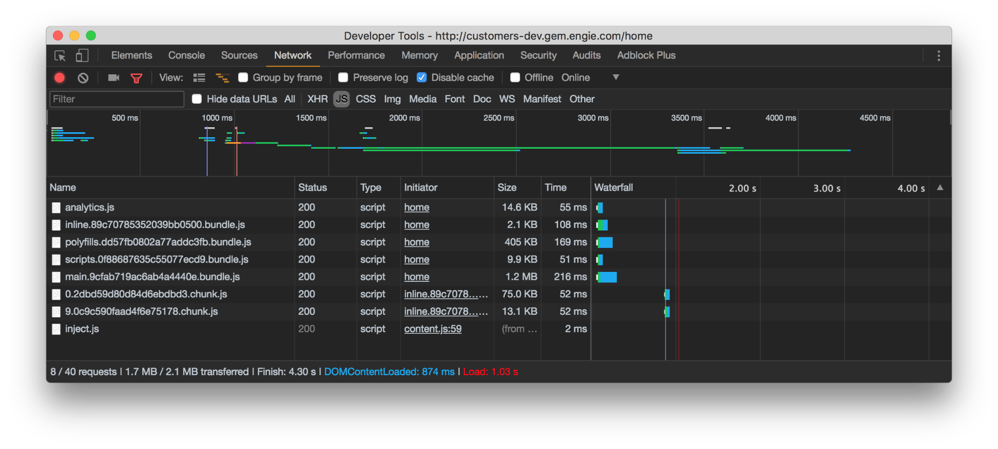
Here we find our classic Angular JS bundles, as well as two chunks (modules) corresponding to the route requested when starting up the application.
And here’s the status of our <head> at the same time:
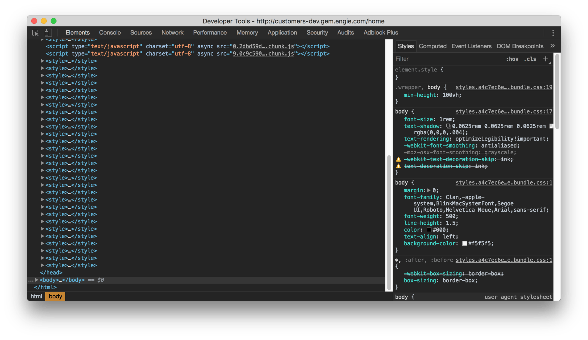
We can see that our javascript chunk has been correctly inserted into the application, as well as the style of those components.
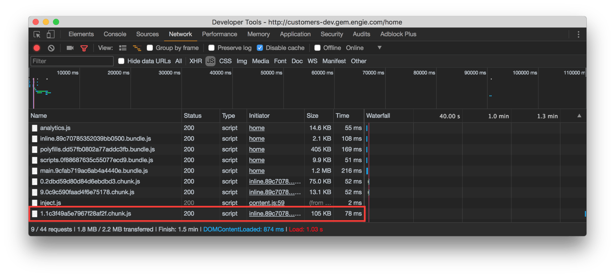
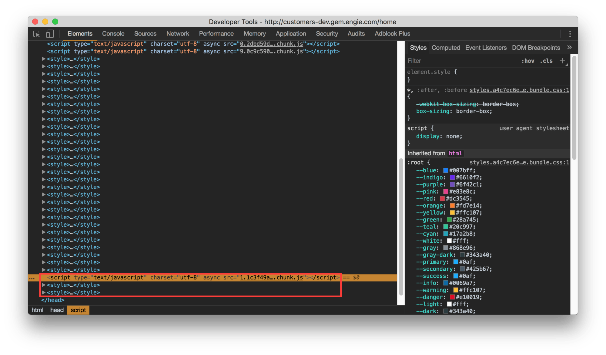
The lazy loading is therefore correctly applied to the styles, as long as we respect the component by component breakdown pushed by Angular.
Conclusion
The time of cobbling together styles in assets folders and only managing rules at a global level is over. From now on, Angular (along with other javascript maxi-frameworks) deals with style like the rest of the stack, as REAL developing, with imports, components, lazy loading, variables etc.
Here’s a repository that offers a more detailed look at the subjects covered in this article:
https://github.com/ferdinanddoremus/starter-ng5-BS4-Material